Movie posters are often designed to grab the audience's attention by using eye-catching visual elements and intriguing promises, which can sometimes make the poster more appealing than the film itself, which may be more complex or less captivating.
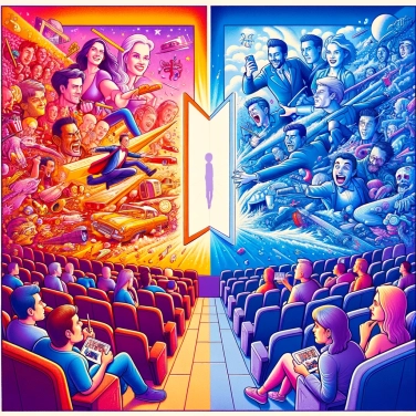
A good movie poster immediately attracts the eye because the human brain loves strong and immediate images. Our gaze prioritizes bright colors, marked contrasts, and expressive faces: we react instinctively at first, and only later in a reflective manner. Unlike a film, which takes time to reveal its plot and characters, a poster instantly establishes an atmosphere or emotion by touching us visually. It stimulates our curiosity with just enough hints to spark interest. A single glance is enough to create a strong impression that often lingers more intensely than an entire film.
Poster creators intentionally choose the most appealing elements, even if they only represent a tiny part of the film. They will select a super spectacular action scene, an ultra-charismatic character, or a key moment filled with emotion. For example, showing the attractive face of a star or emphasizing a shocking scene to directly spark the audience's curiosity. Sometimes, they highlight secondary details for their eye-catching or intriguing nature, even if they ultimately have little importance in the film's story. In short, only a handful of carefully selected elements appear on the poster, just to immediately capture attention and encourage further interest.
A movie poster gets straight to the point: it takes the entire complex story of the film and reduces it to a single striking image. To do this, it often uses iconic scenes or characters, discarding all the complicated nuances that make the film itself rich. This process of simplification creates a visually appealing but frankly exaggerated narrative. The poster can outright promise non-stop action or intense emotions, while the feature film naturally allows for slower, nuanced, or contemplative passages. This kind of simplification is a bit like a very catchy summary: effective but sometimes misleading in terms of actual content.
To draw the eye directly, the posters rely on a precise balance between empty spaces and areas saturated with details. Undoubtedly, they heavily play with strong contrasts, vibrant or, conversely, dark and mysterious palettes, perfectly designed to create a striking impression at first glance. The choice of fonts, often stylized and unique, further enhances this ultra-catchy aspect. They also frequently employ a dynamic composition: perspective effects, diagonal lines, or variations in the scale of characters or objects—basically anything that gives instant rhythm to the eyes. Behind all this, it’s really a matter of visual psychology at play, with carefully studied proportions so that your gaze follows a specific path on the poster. A true journey meticulously crafted to keep you engaged with it.
Producers know very well that the audience is sensitive to what they imagine seeing, rather than what they will actually see. As a result, they fully capitalize on spectacular visuals that promise crazy action scenes or ultra-original stories, fully aware that the film behind it will rarely have the same intensity. The goal? To generate extreme curiosity that drives people to the cinema. It doesn't matter if you come out disappointed: you've already bought your ticket, mission accomplished for them. Key elements of the narrative are often exaggerated or disproportionately highlighted to evoke strong emotional expectations in the audience. One then believes they are witnessing an epic film, rich in impressive twists, while the reality on screen is often much more mundane.
The specialized profession of movie poster designers has existed since the early days of the film industry. Several iconic posters are attributed to famous artists, such as Saul Bass with his iconic creations for Hitchcock.
The original poster of the film 'Jaws' was so visually effective that it created a lasting fear of sharks, profoundly influencing the public's perception of these marine animals.
In the early decades of cinema, posters were often hand-painted, enhancing their artistic and unique quality. Today, these vintage posters have become highly sought after by collectors.
Some posters for famous movies were designed even before the script was finalized or filming began, sometimes leading to significant discrepancies between the promoted image and the actual content of the film.
Designers typically select the most fascinating or intriguing elements of the film, sometimes even exaggerating their importance, in order to spark curiosity and create high expectations for the movie.
The poster is designed to condense the highlights or spectacular elements of the film into a single captivating and promising image. In contrast, the film features a complex narrative, the quality of which may vary throughout the viewing experience.
Sure! Here’s the translation: "Yes, in most countries there are regulations prohibiting clearly misleading advertising. However, the line between tolerated marketing exaggeration and misleading advertising is often thin and varies according to local legislation."
Frequent techniques include the use of vibrant colors, striking or iconic images, bold typography, and a balanced graphic composition to immediately capture attention.
The psychology of colors plays a major role in unconsciously triggering different emotions in the viewer. For example, red evokes excitement or danger, while blue inspires trust or tranquility, and this directly influences the perception of the film.
0% of respondents passed this quiz completely!
Question 1/5